IxDA.org
Goal:
Redesign Interaction Design Association’s website.
Methods: User Interviews & Surveys, Affinity Mapping, Competitive Analysis, Design Studio, Usability Testing
Role:
UX Designer
3 Week Design Sprint
Goal:
Redesign Interaction Design Association’s website.
Methods: User Interviews & Surveys, Affinity Mapping, Competitive Analysis, Design Studio, Usability Testing
Role:
UX Designer
3 Week Design Sprint

Interaction Design Association's website needed to be updated. The volunteer run organization had grown exponentially over its 12-year lifespan without any paid design or technology support. Their current website didn't reflect this active, growing, global community.
We were tasked with creating a simple, modern, and responsive website to reflect the vast and vibrant Interaction Design community. Within that request was also a caveat: the acknowledgement that volunteer organizations must have a more optimized workflow. From prior experience, IxDA had learned that a site that requires much curation and maintenance will wither on the vine. The new ixda.org must be evergreen without constant tending.

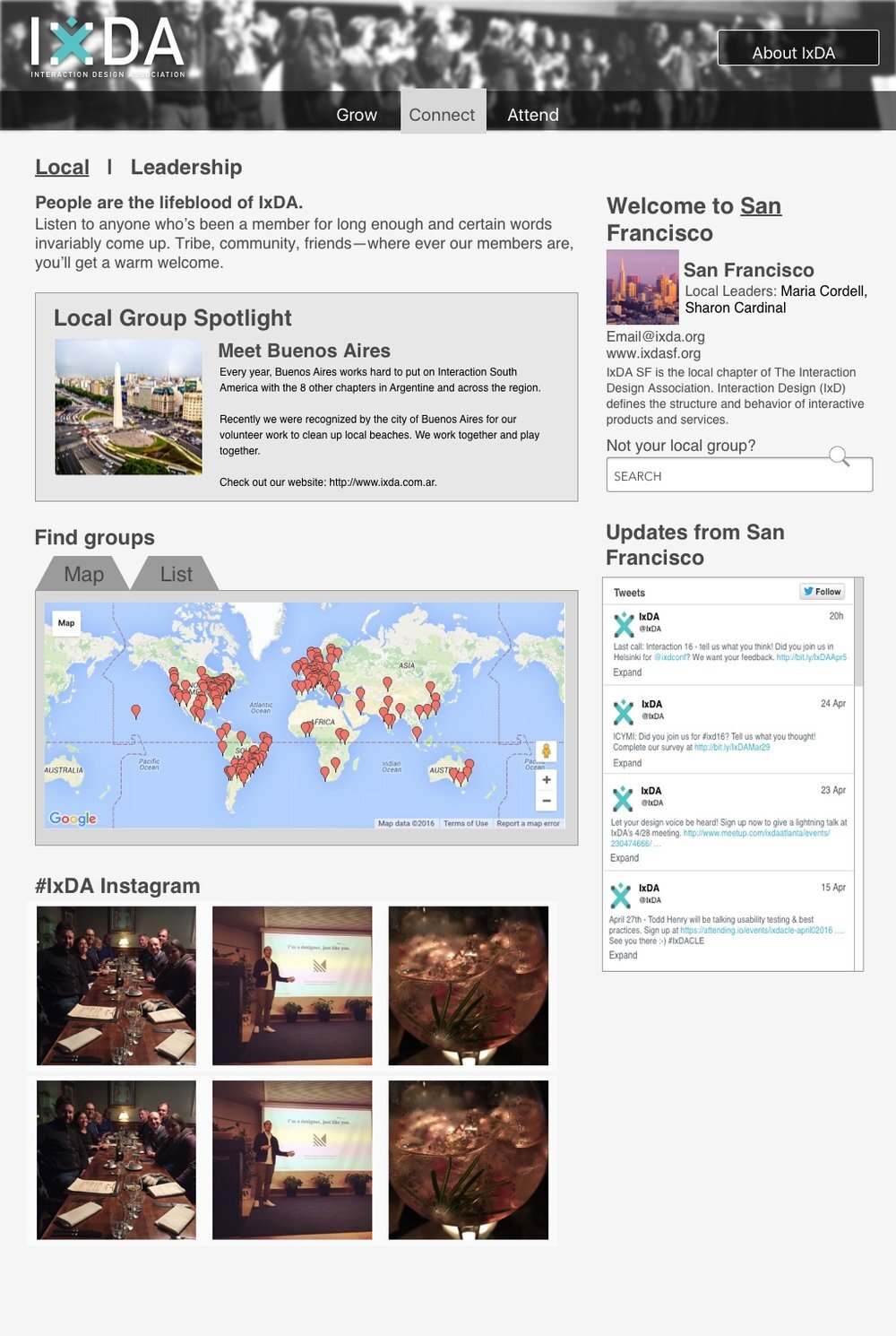
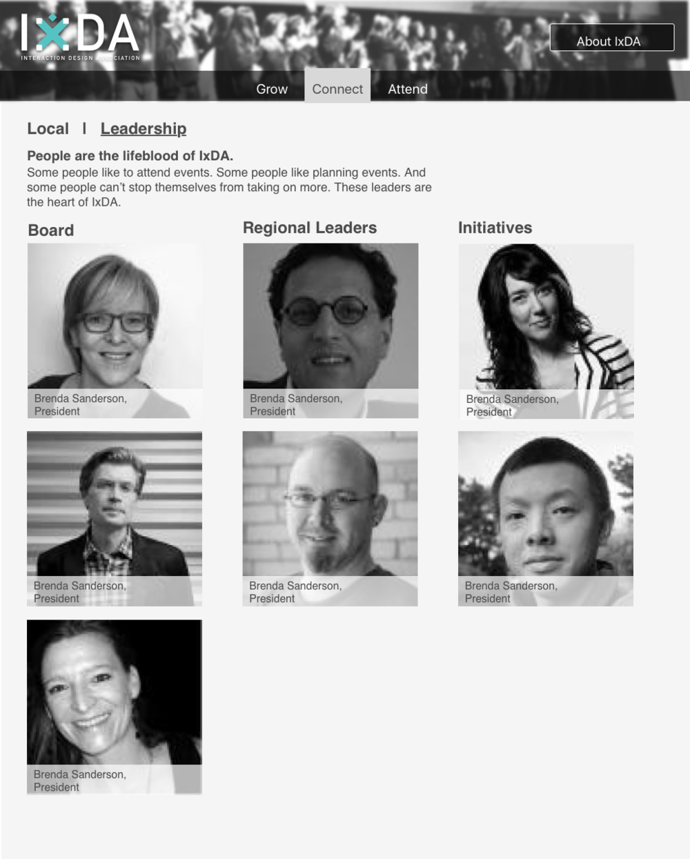
Community first
Showcase the efforts of our diverse and passionate membership
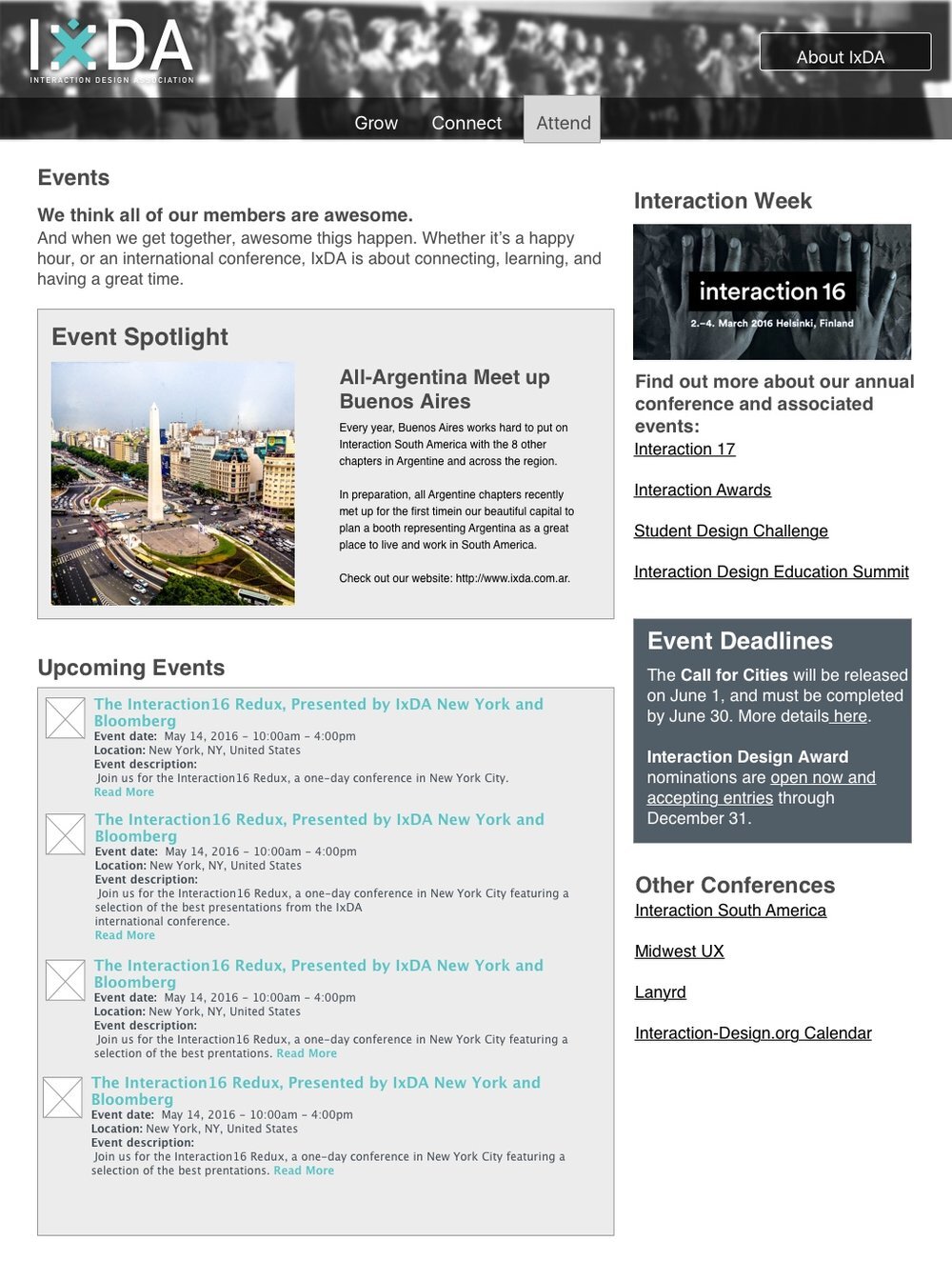
Create a hub
Allow users to find basic info, but direct them to more granular info in other places (such as sites maintained by local groups)
Design for a wide audience
IxDA serves designers of many levels, as well as non-designers and businesses
Demonstrate a clear onramp to engagement
Allow users to get involved, at any level they choose
We conducted 10 interviews from stakeholders, IxDA members, and nonmembers.
One-stop-shop to get all IX information
An easy pathway to find local communities
Describe mission, values, and who we are
Celebrate IxDA’s identity and friendly community
Show what’s happening in the community right now

We looked at a variety of creative community's and found a few common themes we hoped to achieve with the redesign:
High quality visuals and videos.
Large maps and up-to-date content including articles and blogs.
Clear calls to action.
One problem we wanted to avoid with some of these websites was that there were less maintained and empty pages once you navigated deeper into the sites.

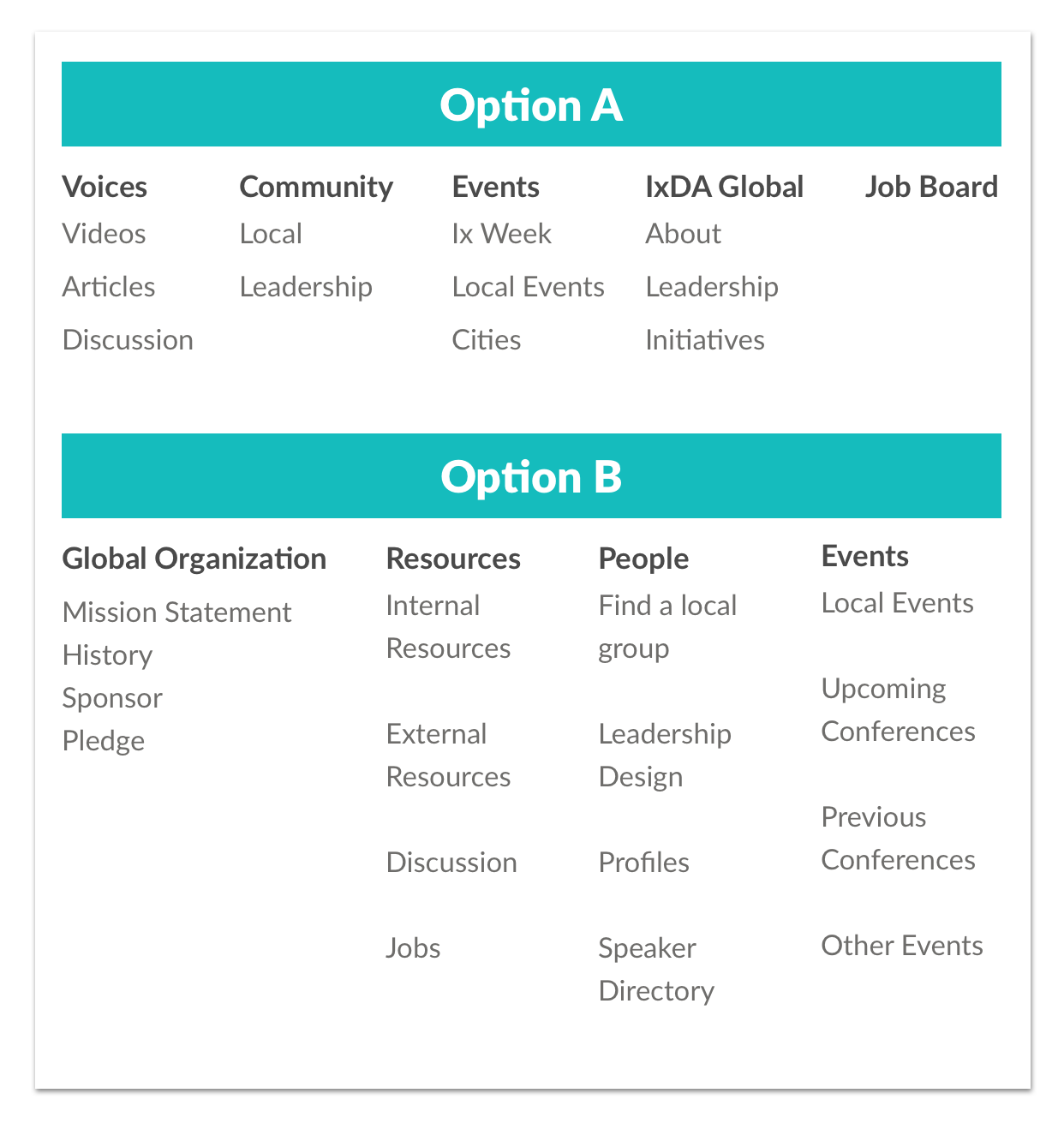
Using Card Sorting and Feature Prioritization we created a few navigation options for our usability testing. Option A resonated more with our users. We brought our prototype to General Assembly to test with new and seasoned designers.
After mapping out our main pages for the MVP, we conducted a Design Studio to get a variety of page layout and interaction options.